Saturday, February 25, 2012

Bonjour Tristesse - but not in the Bedroom please!

Please do not get me wrong here - I find this bedroom extremely elegant, stylish and very well designed. All the elements complement each other perfectly. But it looks really depressing. There is something important missing: a piece of colour!

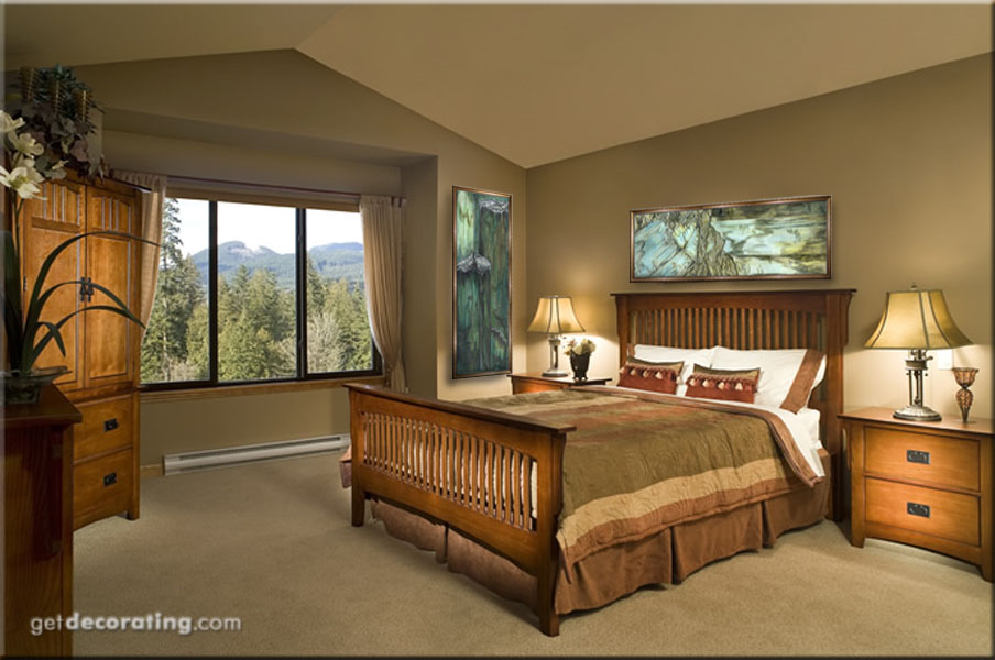
I know - a bedroom should be kept mostly in  "neutral" colours, because it is meant for relaxing, getting a good night sleep, yadayada. But I would not want to sleep in a room with depressing colours such as these. Yes - depressing because that abundance of greys and blacks would rather remind me of a funeral parlour than a bedroom in which I could feel well.


A single piece of bright colour would do the trick: f.e. with this brightly coloured silk scroll, mounted on a simple stretcher frame without the upper and lower part as can be seen in the original scroll (please see below). But check for yourself. It would not change the design of this room but add a tiny bit of life and friendliness, warmth and excitement and keep off depressing feelings...


The original silk scroll was handpainted and additionally quilted with silk thread to add texture and depth.
This kind of scrolls is reminiscent of ancient Chinese or Japanese scroll paintings - their construction yet is completely different and has been developed by myself.

While traditional Japanese and Chinese silk scrolls are made from very thin painted silk, that is glued to paper which again is normally covered by patterned silk, my scrolls consist of 3 layers of fabric and no paper at all.

The middle piece is constructed like a quilt with a layer of very thin batting between the top layer which is the painted silk and the back. Headpiece and footpiece are normally made from silk as well, which has been fused to a thin layer of rayon fabric.


"Desert"
48" x 24", silk scroll

©Petra Voegtle

Finally top and bottom part of the scroll are sewn with a narrow tube at the end to be able to push a dowel through the fabric which is used for hanging. But as I said already - top and bottom part could also be removed in order to mount the middle piece on a stretcher frame.
~~~
 

Wednesday, February 8, 2012

Hanging Art in an unorthodox Way continued...

Well I promised to show some more examples how you could change the original idea of hanging a certain painting. Normally you could not do this with a realistic or representational painting but in this case it works beautifully again. The colour composition looks as if this was made for this room from the beginning:

(after)
The original image (see below) of this wonderfully airy bedroom looks a bit blank so my virtual and visual addition would be this silk painting if it were my room.

(before)

Check out how the painting normally would be hung here.

Here are more ideas of hanging art in an unorthodox manner:

(after)

The wall art in the original image of the room is repeating too many of the room's colours:

 (before)

Don't misunderstand me - I like the original art but it does not really spark great interest because the colour compositions "disappear" in the room itself. My suggestion would have been something that glows a bit more, that adds some additional colour such as the crystal paintings from my minerals series:


"Aquamarine" and "Tourmaline I"
(from the "Minerals" series)
40" x 13", acrylic on cotton
©Petra Voegtle

And here is another one of my paintings that could be hung horizontally instead of vertically with the result of looking completely different than hung in the original manner:

(after)

Again - I like the original painting on the wall in this bedroom but it is very dominant so that any additional art would be overkill. As I would like to hang something above the bed - and one of the paintings from the fossils series would be perfect for that - I would have to replace the original painting with another one, less prominent. What do you think about this alternative?

(before)

I really love to play around with these images and create new ideas:

"Triassic Prints I + II"
(from the "Fossils" series)
40" x 13", acrylic on cotton
©Petra Voegtle

~

Thursday, February 2, 2012

GUEST POST: Design Shuffle

Here is another guest post: this time from an online place for interior designers - Design Shuffle - and it is "all about expressing personality through decorating with art".

~

Hello all! It's Mari from Design Shuffle, a special online place for interior designers, design professionals and enthusiasts. With thousands of photos to look through each day, this website is your one-stop shop for decorating ideas!

Today's guest post here at Art and Interior is all about expressing personality through decorating with art. We're all drawn to specific pieces of art for as deeply personal reasons. Our artful choices reflect our passions and individual personalities. Whether it’s the color, scale or subject matter that catches the eye, art can imbue your living environment with your own personality and sense of style. I hope these appealing spaces will inspire you to add the wonderful element of art to your home.


One look at the focal wall of this light-filled foyer and we know that family and nature are two of this homeowners passions. What a lovely gallery wall dominated by photographic art. Here, it's all about family and natural elements.


Another artfully decorated foyer shows off an eclectic personality with a love of all things vintage. And just so you know the inhabitants of this space don't take themselves too seriously, a few quirky touches are on display.


Art is the focal point in this totally appealing sunroom. Here it's all about the birds with an eclectic collection of avian-centered artwork.


Is it a love of architecture, history or movement and life that drives the personality who inhabits this space? A few unexpected touches complete this stylish, yet comfortable living room design.


Set against sandy walls, seahorse paintings give this space an understated coastal feel and a sense of easy living also reflected in the rest of the decorative elements.


Need dining room design ideas? Bright colors and simple artwork give an impression of warmth and lively style. The velvety upholstery on the dining chair backs is a beautiful work of textile art.


This artist's space is all about a love of the ocean and a deep understanding of its ever-changing color. Unframed and set against a background of pure white, the work speaks for itself.


Calm and soothing, an eclectic space in shades of blue sets the stage for a collection vintage botanical prints. This living room is one of those special interior designs that offer a retreat from the busy cares of everyday life.

Images 1 | 2 | 3 | 4 | 5 | 6 | 7 | 8

How do you like to display your art? Find more great ways to showcase your work at Design Shuffle! You'll find stunning inspiration from Boston interior designers, San Francisco interior designers and much more!

~

Thank you, Mari, for this lovely post with lots of very inspiring ideas!

~~~

Wednesday, February 1, 2012

Hanging Art in an unorthodox Manner

First thing I noticed when I saw this photo was the wonderful light in this bedroom.But as usual I missed some art on the wall. As you cannot see in this vignette whether there is more space in the room besides the place  above the bed I decided to suggest to hang a silk painting in a different way than it had been painted for:


Not very often you have the opportunity to hang a realistic/representational motif other than it was meant to hang but in this case I thought it would work. Especially the colours of the silk painting with the sparkling of the mother-of-pearl pigments in the paint would match the light in this bedroom beautifully:


Here is the silk painting in its upright format (from the Magic Creatures series and one of my favourite paintings in general):

"Nautilus"
(from the Magic Creatures Series)
silk, 40" x 13"
©Petra Voegtle

But it wouldn't be me if I had not found another example for hanging this painting horizontally - in one of the next post...
~~~

Related Posts Plugin for WordPress, Blogger...