Showing posts with label red. Show all posts

Wednesday, April 6, 2011

Too boring to sleep here?

Imagine you cannot find sleep because you are in a room that is so "calm" that your mind finds nothing to concentrate on? This sounds paradox to you? But exactly this would happen to me if had to sleep in this room. The night is dark and you cannot see anything anyway - you might reply - but there is something else to keep in mind. You look at a room normally with daylight or artificial light. So you SEE how a room looks like and this is in your memory already. A boring room is not a room where we find peace and calmness - boring things can even annoy - and gone is the sleep...

The room below is probably "only" a guest room and not the master bedroom but in any way it looks boring I'm afraid to say. Maybe the owner is going to decorate this room a bit further - just a guess.

There is nothing in this room that interests the eye. That's a shame. You don't need much to add a bit of a focus, an object of interest. Without this the room just looks very unkind.


I would have chosen a piece of art painted in bright colours that build some contrast to the wall. In this case it is "Sari 2", a painting and handprint with an interesting pattern, framed in a decent gilded wood frame.


"Sari 2" is an acrylic painting on heavy water colour paper that has been additionally hand printed with some ancient Indian wood blocks from my collection in order to add some beautiful patterns which normally are used on Saris and other textiles.

"Sari 2"
(from the Prints series)
15" x 20", acrylic on paper
©Petra Voegtle
~

Saturday, March 12, 2011

Even in the tiniest Room there is a Place for a Piece of Art!

Yes - that's my credo! And even the tiniest room will look more sophisticated and well taken care of if you place a piece of art that adds some focus. It should not disappear - it should be a bit more prominent.

That's why I would choose something more colourful and prominent than the original images here. Although it contradicts somehow the natural response that you should use something small in a small room it does not always function. You would be surprised what a difference it can make to ignore the rules sometimes...


(original image source getdecorating.com)

"Sari II"
(from the Patterns series)
20" x 15", acrylic on paper
©Petra Voegtle

 ~

Friday, February 18, 2011

The perfect Painting

I really like this sweet little bedroom. Its colours are serene, a perfect mix for mind and soul in order to have a wonderful relaxing night. But it is also a little bit boring. Artwise.

The print on the wall certainly matches the colour concept but it is boring. Even for a little room like this one you could do so much more with the right piece of art.


Now I found the perfect painting for it that would give this room some more attraction - don't you agree? Even if this is probably "only" a guestroom the painting adds an extra atmosphere. I am kind of surprised myself how a single piece on the wall can have so much impact. But I should have known...

I do not want to diminish the work of the interior designer in any way but I want to show that a single piece of art can make a lot of difference - to the better, sometimes to the worse. It is all a matter of taste, emotion and attitude. But it is worth to take time to look for the right piece.

(original image source getdecorating.com)

The acrylic painting is called Red Door and belongs to the Reminiscences series. It has been shown various times in different environments. You can see this here:

 "Red Door"
(from the Reminiscences series)
26" x 18", acrylic
©Petra Voegtle
If you would like to know more about this painting i.e. the history and background please see this link. If you would like to see more paintings of this series please see here.

~

Thursday, November 18, 2010

Colours of the Desert - Dry Land - a surreal Landscape

This painting belongs to a series called The Magic of Landscapes and I have shown it already several times in different environments. Here are now some details about it. The series is also part of a concept and the theme of this concept is to show the magic that surrounds us everywhere and is recognized easily when we open the eyes. This series explores the magic of landscapes and special places, the moments of awe when we see the miracles that are created by nature rather than human phantasy, the moments of spiritual connection with the past and the future and the moments of transformation through human imagination.

Dry Land is a semi-surrealistic landscape. Inspired by the colours of the desert, which can change completely during a day, this work shows the paradoxa of a landscape that obey the natural laws of nature. While the dune like formations seem to be a solid mass, the surface of the dried river bed  appears  fragile and delicate. But in reality the opposite is true: dunes are the fragile element, ever changing with the wind and the dried river bed has turned into solid earth, hard as stone when the water is all gone.


(click on images for enlargement)
"Dry Land"
(from the Magic Landscapes Series)

40" x 21", silk
©Petra Voegtle


Under following links you can find some room examples featuring this painting: interior1, interior2, interior3

This painting has been painted on silk, has been gallery wrapped and is ready to be hung with or without additional frame.

(This work won an "Artist of the Year" award at the Boxheart Gallery in Pennsylvania and a solo show.)


In addition I am presenting here a version of the painting how it could look like when framed in a sophisticated frame. It makes a difference - doesn't it?

~

Sunday, November 14, 2010

Saris on the Wall - as Paintings

This is a wonderfully airy hallway - space in abundance, no clutter. There is plenty of room for decoration if you want to do this and I have some suggestions.
My brandnew work would look fabulous on these walls, an eyecatcher in colour and some teasing for the viewer because not everything is as it seems...


If you look at the original setting there is too much blank space in my opinion and a focal object is needed. I don't know why the interior designer placed this chaiselongue in this room as its purpose is not quite clear to me - maybe it is only an extension to the garden/terrace area but even then I miss some additional seats.


The two paintings belong to my brandnew series about Patterns. I painted in various red shades on heavy watercolour paper and finally added block printing with ancient Indian handcarved wooden models from my collection. The graphical elements were highlighted with metallic pigments to evoke a more authentic feeling of those heavily embroidered saris Indian women tend to wear for their weddings.

"Sari I"
(from the Patterns series)
20" x 15", acrylic on paper
©Petra Voegtle

The second sari piece was shadow printed with 2 colours, green and gold, which can be seen in the detail photo.

"Sari II"
(from the Patterns series)
20" x 15", acrylic on paper
©Petra Voegtle


If you would like to know more about this series please check my blog Images and Imagination which is all about art...
~

Friday, November 12, 2010

Red and Green - a complementary Composition in the Bedroom

Using complementary colours such as red and green in a room is always a bit tricky. If you choose this system, you might want to select a subtle colour and a dominant colour, to prevent the colors from clashing. In this room the red is very dominant - so we need a subtle green to make this really work. It was tried with a green toile used as a window drape but I think it is not enough. It is a bit off balance.

I have this photo on my computer since a long time and I always thought that I like this room somehow although I find the red walls a bit too prominent. But now I found the right solution with this painting, giving a bit more balance to the red walls and matching exactly the window drapes.


In the original photo a piece of wood carving or cast iron was chosen for decoration above the bed but this added quite a dull element to the room and did not change the imbalance in my opinion:


The painting itself belongs to my new series of paper works on heavy watercolour paper. It is called Green Marble - I painted a faux marble pattern as a basic background and added some hand printing with ancient Indian wooden print blocks from my collection in order to create a graphical element to the painting. Golden metallic pigments were added to create additional highlights to the graphical pattern. 


"Green Marble"
(from the Patterns series)
25" x 15", acrylic on paper
©Petra Voegtle


The nice thing with this painting is that you can hang it how you wish, vertically or horizontally...
~

Sunday, October 3, 2010

A Painting that complements the Cushions

From time to time I find this funny - looking for a piece of art that complements other accessories. Hm - I don't have a problem with that even if I consider myself a serious painter. I feel that art should be on a wall and if someone is looking for a great decoration piece - fine with me.

I do not paint for mere decoration, my work is reflecting my interests, my emotions, sometimes anger but more often joy, fascination and admiration. And most of all my work is coming from memories and impressions I have had the luck to see somewhere on this world, be it in the neighbourhood or on the other side of this planet.

 original image source and with courtesy of 

"Red Door"
(from the Reminiscences series)
26" x 18", acrylic
©Petra Voegtle
If you would like to know more about this painting Red Door please see this link. If you would like to see more paintings of this series please see here.

~

Monday, September 6, 2010

Machu Picchu - a Silk Painting about a magical Place

This silk painting Machu Picchu belongs to the Magical Symbols Series. I love the warm colours - just the right thing to warm up your room when the temperatures start to go down again at this time of the year.
Machu Picchu is truly a magical place, an archeological site which still holds many secrets. Thousands of tourists undertake each year an incredibly exhausting trip to this place which is not easy to reach as it is hidden high in the mountains of the Andes. 

"Most archaeologists believe that Machu Picchu was built as an estate for the Inca emperor Pachacuti (1438–1472). Often referred to as "The Lost City of the Incas", it is perhaps the most familiar icon of the Inca World.
The Incas started building the estate around AD 1400 but it was abandoned as an official site for the Inca rulers a century later at the time of the Spanish conquest of the Inca Empire. Although known locally, it was unknown to the outside world before being brought to international attention in 1911 by the American historian Hiram Bingham. Since then, Machu Picchu has become an important tourist attraction.
Machu Picchu was declared a Peruvian Historical Sanctuary in 1981 and a UNESCO World Heritage Site in 1983. Since it was not plundered by the Spanish when they conquered the Incas, it is especially important as a cultural site and is considered a sacred place." (from wikipedia)"
Whatever might turn out to be the real purpose of Machu Picchu - there is no doubt that this is a place full of magic and an incredible aura. Until today artefacts are found at this site and may lead to new discoveries.

"Machu Picchu"
(from the Magic Symbols Series)
40" x 13", silk


The ancient golden ornaments certainly add a special touch to the historical city and dreams about the lost treasures of the Inca people...
~

Monday, August 16, 2010

Views, Views, Views - Dining with all Senses...

Rooms with a breathtaking view do not need much decoration but how about enhancing breathtaking views with another impressive view on a painting? Again I replaced the original art virtually with a silk painting that would perfectly match the colours in this room...

   original image source from http://www.getdecorating.com


This silk painting has been inspired by the breathtaking landscapes on the Hawaiian Islands, especially the Haleakala National Park. You can read more about it here if you like.

"Haleakala"
(from the Magic Landscapes Series)
silk, 21" x 40"
©Petra Voegtle
~

Here and here are more room examples for this painting.

Saturday, July 17, 2010

A Firework of Colours - in a Crystal

Remember the other painting about tourmalines? It is here. This is another one with completely different colours and different shapes. Tourmalines belong to the most variegated minerals. Take the complete colour wheel and you will have all potential hues and shades of the crystal.That's so fascinating with tourmalines.

This one has been painted in acrylic on cotton. You can hang it with or without an additional frame. Illuminated with the right light the colours of this painting start to glow...


(Click on the images for enlargement)
"Tourmaline II"
(from the "Crystals and Minerals" series)
40" x 13", acrylic on cotton
©Petra Voegtle


Some virtual examples of a room with this painting on the wall are enclosed in the following links: interior1, interior2

I have added some photos of this fascinating mineral:


(image source: http://mineralminers.com/)

And here is another, very unusual tourmaline crystal in order to show you how variegated this mineral is:

(image source: http://www.crystal-treasure.com)
~

Friday, June 18, 2010

The Palace - a Silk Scroll as an alternative Decor

I am always looking for alternatives and different ideas. I think any room with a traditional interior design could also become something very special with a tiny exotic touch, something not everybody calls her/his own. This could be any object or a very special piece of art.

Today it is quite common to mix styles - every epoch has at least one speciality - so why not take advantage of the parts which we like and avoid the rest we may not like.
Curved lines are combined with straight ones, bright colours are mixed with subdued hues and as long as there is a certain harmony depending on layout, objects and space everything may be used if you like it.

Natural taste is as is known very subjective and driven by subconscious vibes. Yet there is another taste that can be taught and learned i.e. you need to learn about the rules of composition. These are in principle the same rules you need to know when creating an excellent piece of art. A good painter will always recognize whether a painting is unbalanced and inherits severe mistakes - a good interior designer will know immediately when objects (including furniture) are positioned the best way, where colours, textures and patterns compliment each other and where focus is necessary to lead the eye: when everything plays together to form a harmonious unit. Harmony in my opinion is the most important part in a room in order to feel peace and affinity.

Here is a great quote that says it all.
"A harmonious room will be achieved when the rules of scale, balance, contrast and rhythm are followed. In addition, a harmonious room will have furnishings and other elements that relate to one another within a interior decorating scheme." (Interior Decorating)

What I have done here was virtually replacing the original display cabinet with this silk scroll.The original image (see below) had an open build-in display cabinet with a collection of very beautiful and probably very expensive china. But you have to see this in detail very near. From the distance this somehow retreats into the background despite the lighting. I would be looking for an eyecatcher, something that draws you in even from a greater distance.


  original image source from http://www.getdecorating.com 

the original design

The scroll is from the series of ornamental silk scrolls which depict motifs from southeast Asia/India. The Palace is an hommage to the sophisticated ancient architecture you can find in India. If you would like to read more about the "making of" this extravagant piece and see a lot of large detail images please check this link.

"The Palace" 
( from the Ornaments series)
75" x 23", silk scroll
©Petra Voegtle
~

Tuesday, June 15, 2010

A Bedroom with warm Colours and a Mystery on the Wall

This bedroom looks wonderful with its warm colours. I love cozy bedrooms. The magnificent bed with its breathtaking headpiece just adds the right touch to a romantic feeling. What about dreaming here of an amorous time travel back into the Italy of the 19th century into one of these ancient palazzi? A room such as this could be very inspirational...

Normally I am not a friend of ruffles but used in a decent way as in this room they are a perfectly matching decor and by far not as decadent as the interiors of those ancient palazzi.

The original painting on the wall was also a good match but I would add a bit more mystery of course, a touch of ancient lives and a bit more exotic scenery. So I virtually replaced the original painting with this silk painting/collage of Machu Picchu from the Magic Symbols series.

  original image source from http://www.getdecorating.com

The series of the Magic Symbols describes the icons and secrets of ancient cultures mankind has surrounded himself since the beginning of time. The single images are multi-layered, each telling different stories about the human past, the beliefs, the fears, the longing for protection and hopes for a fullfilled life. No matter how old thoses symbols are and from which region of the world they come from and what they stand for - they keep returning from century to century, from one language to another.

While the landscapes of the ancient cultures might have changed due to climatic or socio-political transformations their heritage has not. They left us the fundaments of human civilization.

"Machu Picchu"
(from the Magic Symbols Series) 
40" x 13", silk

~

Saturday, May 29, 2010

Bright Red or a fascinating Landscape on the Wall?

I must admit when I saw the picture of this hallway I was fascinated. I think the interior designer did an excellent job by placing that bright red photo(?) as focal point on the wall. It sends a lot of heat into these white walls - a wonderful and necessary contrast. You can see the original photo below.

But then I thought as brilliant and eye catching this bright red photo is, it probably will soon lose its attraction - I mean there is not so very much to discover in this photo, it completely lives from the colour. It's a similar issue with a bright coloured dress or maybe even a car - it might be a screamer for some time, a prominent focus for everybody but after some time you get bored with it and you wished to have chosen something more sophisticated. I am offering here an alternative: my suggestion would have been this triptych, a large silk painting that consists of 3 panels. But judge for yourself.

Btw - the peculiarity of this triptych is that you could hang each panel separately because it was painted in a manner that each panel shows a complete landscape in itself...

original image source from http://www.getdecorating.com

the original image

(Click to enlarge)
 "Canyon"
(from the Magic Landscapes series)
 

40" x 63", Triptych, silk
©Petra Voegtle

If you would like to see more detail photos about this painting please check this link. Here are some more room examples for this painting: interior1, interior2
~

Tuesday, April 27, 2010

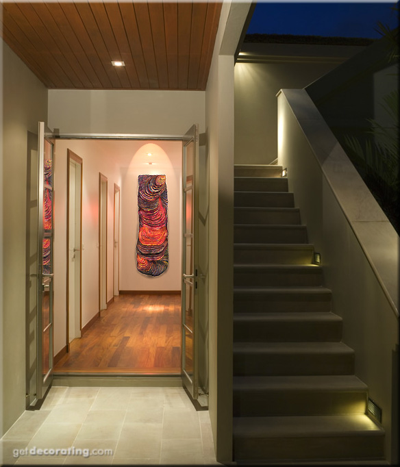
Flowing Lava in a Doorway

The cloud of ashes is gone and things are going "normal" again in Europe. But could you ever talk about normality with the knowledge that beneath our feet the earth is hot and fluid and could burst any time depite all scientific research anywhere on this planet?
Did you know that worldwide around 20 active volcanos are doing their job i.e. erupting right now? And about 50-70 volcanoes are active (erupting) each year (from Volcano Discovery). A creepy feeling. But if we would give way to all our fears life could not go on.

When I saw this image of a doorway/stairway I thought it would be the perfect place for Pele, the silk carving. The original painting that hangs on this place of the wall is surely an eyecatcher with its vibrant colours (see below) but I am sure the designer would have chosen the dramatic silk piece if s/he had known about it - not? What would be your choice?


original image source from http://www.getdecorating.com

The silk sculpture was inspired by the Hawaiian legends of Pele, the Hawaiian Akua (Goddess), the fire goddess, mother of all life which comes out of the depth of the earth. 
In Hawaiian mythology women were a powerful source of new life and source of spiritual power. In the Polynesian world Mana Wahine - the power of woman - was a force that must never be ignored. It was Hina (Woman) who gave birth to new life, Hina controlled the moon, the tides and the reefs and Hina had the secret of fire.

Pele incorporates a technique called silk carving©, which is a development by the artist. The intent of this technique was to create a symbiosis between carving and fiber art. The surface of the fiber was transformed completely into a relief. The upper layer of this piece was made from one single piece of silk - nothing was sewn on top to add depth. Additionally paints and pigments were used in a manner to give the visual impression of flowing lava in all its glowing colours and the viewer is supposed to feel the heat. But it is "only" a piece of soft sculptured silk.

 "Pele"
( from the Hawaiian Symbols series)
silk carving, 48" x 17"
©Petra Voegtle

If you would like to see more detail photos please check this link

Btw - this art piece was shown at several art venues in the USA and was featured by art critic Cate McQuaid in the Boston Globe.

Related Posts Plugin for WordPress, Blogger...