Sunday, May 30, 2010

Matching Colours - A Painting and a Bowl

How far could you drive matching colours? Well I have an alternative to the original painting that even matches the bowl in the hallway. Crazy? No - funny and not meant to be too seriously. If only the owner of the house or the interior designer would have known earlier...! But honestly - what would you say about mounting this triptych on the wall?

On top of matching colours I also would suggest an unusual iron cast frame (currently virtually mounted but a real idea) which would perfectly compliment the Chinoiserie table and the iron cast stairrails.

The painting itself is a triptych, painted on 3 silk panels and was inspired by the ancient city of Ayutthaya in Thailand.
Ayutthaya is one of those special places which emanate an aura of magic and fascination ancient sites have in common. Ayutthaya (1350 - 1767) was once the golden capital of the ancient kingdom of Siam (Thailand) - a magical city with about one million inhabitants around 1700. It was destroyed by the Burmese and finally abandoned. Bangkok became the new capital.
Today nothing is left but ruins. Only hundreds of Buddha statues, partially intact or restored, prangs (reliquary towers) and monasteries, which form the Ayutthaya historical park, create a place of great magic and belong to the UNESCO World Heritage.


original image source from http://www.getdecorating.com
the original image

click to enlarge
"Ayutthaya"
(from the Magic Landscapes Series)
40" x 39", silk triptych
©Petra Voegtle
 
If you would like to see additional room examples please check these links: interior1, interior2.
~

Saturday, May 29, 2010

Bright Red or a fascinating Landscape on the Wall?

I must admit when I saw the picture of this hallway I was fascinated. I think the interior designer did an excellent job by placing that bright red photo(?) as focal point on the wall. It sends a lot of heat into these white walls - a wonderful and necessary contrast. You can see the original photo below.

But then I thought as brilliant and eye catching this bright red photo is, it probably will soon lose its attraction - I mean there is not so very much to discover in this photo, it completely lives from the colour. It's a similar issue with a bright coloured dress or maybe even a car - it might be a screamer for some time, a prominent focus for everybody but after some time you get bored with it and you wished to have chosen something more sophisticated. I am offering here an alternative: my suggestion would have been this triptych, a large silk painting that consists of 3 panels. But judge for yourself.

Btw - the peculiarity of this triptych is that you could hang each panel separately because it was painted in a manner that each panel shows a complete landscape in itself...

original image source from http://www.getdecorating.com

the original image

(Click to enlarge)
 "Canyon"
(from the Magic Landscapes series)
 

40" x 63", Triptych, silk
©Petra Voegtle

If you would like to see more detail photos about this painting please check this link. Here are some more room examples for this painting: interior1, interior2
~

Tuesday, May 25, 2010

It's all about Colours...

When I enter a room or look at photos of rooms my spontaneous reaction is a response to the colours. This is the most important impression for me. Everything else that fills a room comes much later and can be even totally secondary. It is the colour that spreads the emotion,gives you a feeling of being at home and peace of mind. Yet sometimes I feel repelled, even sense a kind of hostility and alieness.

This bedroom may not be spectacular and probably the interior designer did not mean to create an extremely sophisticated room but in my opinion s/he's done a wonderful job to create a room that is calm, cosy and peaceful. Exactly the right background to find a good sleep after a long busy day, a room where you still read a couple of pages of a novel before you switch off the lights.

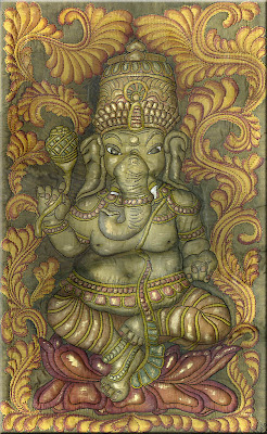
I could not help it but I thought the silk carving would be a nice compliment for this room, colours are wonderfully matching and the Lord Ganesha would certainly watch over your sleep...

original image source from My Home Ideas/ Southern Accents

"Ganesha"
( from the Angkor's Faces series)
silk carving, 39" x 19"
©Petra Voegtle

What is a  silk carving©? This is a development by the artist - it was evolved out of the trapunto techniques of quilting. The intent of this technique is to create a symbiosis between carving and fiber art. The surface of the fiber is transformed completely into a relief. The upper layer of this piece is made from one single piece of silk - nothing is sewn on top to add depth. Additionally paints and pigments are used in a manner to give the visual impression of other materials such as stone, wood, metals.
If you would like to read more about the "making of" please check this link.

~

Wednesday, May 12, 2010

A Bedroom in Turquoise and a Rain Dancer on the Wall

I love the colour of this bedroom. It is so reminiscent of the translucency of the sea which I love in any weather, at any coast. I am a water person much more than a land person and I dream of living near the sea one day.
When I see colours such as this I can hear the seagulls calling and the music of the waves. What a soothing sound, calming and exciting at the same time.
I added virtually a painting on the wall - one of my favourites: The Rain Dancer from the pigeons series. These are all unusual portraits from members of my feral pigeon family about whom you can read here in the Pigeon Tales.

(click on images to enlarge)
original image source from My Home Ideas/ Southern Accents


"The Rain Dancer"
(from the Pigeons series)
 

18" x 26" (without frame) acrylic
©Petra Voegtle

 If you would like to know more about this series please check this link.

~

Friday, May 7, 2010

A Bedroom for the Romantic Soul

This is truly a bedroom for the romantic soul par excellence and I need to show this to you. It speaks of emotions, of nights spent with reading an old fashioned romance novel while listening to soft music while you can hear the ocean waves washing the sand....
This room seems to be taken out of a film, playing in good Ole England and any minute you expect the pretty young girl opening the door and bringing a basket with delicious fruit and a candle for the night... Geez - enough sugar?

Yes I know it may be redundant to place another painting on these walls but in order to increase the contemplative moments I have the following suggestion - you have to look closely though and the major part of it is left to your imagination...

The painting I am talking about is Contemplation on a Feather from the Pigeons series and is shown below in a virtual gilded frame as I could imagine it in this room.


original image source from My Home Ideas/ Southern Accents

"Contemplation on a Feather"
(from the Pigeons series)
 

18" x 26" (without frame) acrylic
©Petra Voegtle
~
 If you would like to know more about this series please check this link.
~

Wednesday, May 5, 2010

A little Reminder...

Just wanted to remind you that I have another little blog up and running where you can see which art I am selling. Also you can find lots of detail photos there which are showing my work in all details. I hope you enjoy all the photos and the little stories that happen to be part of the artwork. Here you will be led directly to

Art for Sophisticated Interior

I also opened an account on Etsy for my art work so that shopping becomes an easy task. I also wanted to give those people a better feeling of security who do not know me yet. I think it is always a good thing to have an independant organisation to watch over business issues in case you would have any complaints.
I have placed a little button that is linked to my Etsy shop on each work that is represented on Art for Sophisticated Interior to make it even easier to access without sending you around unnecessarily. I have to "warn" you though - at the moment there are only 2 small pieces in the shop waiting for more additions as soon as I find the time to place them there.

This button placed directly with the artwork
 
will lead you to my Etsy shop.

~

Saturday, May 1, 2010

LUXURY FANTASIES: about a House...a House?

Tell me - what are your luxury fantasies about a house?
Quite a while ago I found this elegant hilltop luxury house with green technology (the latter being of interest for me).
"The Hilltop House in Rancho Santa Fe, is a perfect sample of timeless luxurious architectural masterpiece, especially designed to maximize the 360 degree views from its hilltop location and offers an amazing panoramic breathtaking views nestled on a private & gated 2 acre pinnacle setting in Rancho Santa Fe. (continue to read...)"


 (original image source from http://www.momoy.com)

In the description you can read that this "house" contains "6 bedroom suites, 8 baths, office tower, library, and media room with nearly 10,000 square feet of luxury living, plus patios, terraces, and 6 car garages".
What rang a cord in me was the question in one comment "can you still call it ‘green technology’ after using so much of wood?" And the realtor's answer was "The wood for this house was purchased from Canadian Wood Specialties. Their specialty is log salvage. (continue to read ...).
This is definitely a beginning but is it a true change of mind and attitude towards environment? Well - I doubt that.
I know that in some areas of this world space is not an issue at all because there is plenty of it but does man really need that much space to live in? Does true environmental awareness not include the attitude of practising more modesty instead of spending more, using more, building bigger etc.? 
What about habitat of wildlife that is destroyed irretrievably even if it is "only" desert land? I mean this one estate is using more than 87.000 sq ft of land?

This house uses several pools not only one. Isn't this questionable in a semi-arid region where precipitation reaches only 15.24 inches per year? The list would be endless of all those arguments which definitely speak against "green".
What a shame that "green" is only used again as a cheap excuse and sanction... I am disappointed...

~
Related Posts Plugin for WordPress, Blogger...