Wednesday, October 27, 2010

Art is a Stepchild of Interior Design

What I love most in this room is the round arch as opening to the next and of course that magnificent swing. I want one too...

But as usual I am not quite content with the original art that was on the wall - not because I think I have the better paintings (of course I do ) but because I think in many examples I have shown art is definitely not a major element of care or to say it more bluntly - art is the last subject the interior designer was thinking about which I bewail.

Sometimes it appears to me that interior design ends at the cushions on the sofa or bed, that the decorator was tired and eager to get the job done. So something has to go on the wall but there is no money nor time left to spend a bit more energy to fulfill the job. And sadly enough more money is often spent on stupid light fixtures or accessoires which are unneccessary and only dust catchers. Less would be really more. I would rather hang a poster on the wall to fill the place and then take time to look for the perfect painting or other wall art piece instead of buying something cheap and meaningless.

My mantra is when you can afford to spend xxx money for a bag or a designer table ware, you could spend the same money on a REAL piece of art.

Of course you also have the other way round - people spending big bucks on a painting that is intended to be an investment but does not fit into the environment at all. This should rather be kept in the security container of a bank than on a wall then...

I need to add though - in order to be fair - that there are many many examples of interior design where you really can see that every single piece was chosen with great care and diligence and a lot of love for the task. Unfortunately I am not so sure whether this is always appreciated by the clients accordingly...

Now in this example below I thought it would be more appropriate to repeat the hues of the rug and the furniture rather than using the original art piece on the wall. The orange of the painting Naranja adds a bit more warmth to a room that is rather cool despite the gas fire place in the wall.

 original image source and with courtesy of 
the original image  

The acrylic painting belongs to the Reminiscences series, a painting series, that was created from my photo documentary about the Olympic Student Village in Munich, that has been torn down 2 years ago in order to be re-constructed.

"Naranja"
(from the Reminiscences series)
26" x 18", acrylic
©Petra Voegtle
 
In order to create a kind of memorial for the beautiful and often funnily painted walls which are now all lost I took hundreds of photos from the village. But this was not enough for me - I also decided to create a painting series from the most impressive and beautiful parts i.e. walls, doors and windows. The peeling paints and especially the marks all the vines left on the plaster created wonderful patterns and structures. There is an extra photo series only about these wall motifs which you will find here.

More about the painting itself and the whole series you can find under this link .

Saturday, October 23, 2010

Purple - the Colour of the Senses

The colour purple means something special for me. On one hand it is the colour of the holy, spiritual and was reserved to be worn by royals only and the high ranking clerical staff. In some countries and way back into history purple was and is the colour of mourning.

According to Feng Shui rules purple should not be used too often and especially not on walls because it could trigger blood diseases. The only possibility to use purple in a room is for healing purposes - remember the amethyst being one of the strongest healing crystals. Purple has alway been associated with mystery.

But purple has also been connected to poison and rage, it has been an attribute of homosexuality, is associated with contrition and all kinds of extremes. Btw - Dior created a perfume called "Poison" which was filled into a wonderful dark purple glass bottle. I find these components of psychologically tinted attributes extremely interesting. This might also be the reason why the bourgeois, the bores and deadheads of this world consider purple being flagitious, voluptuous, euphuistic and simply vulgar - at least in the times when I was a child. Purple was not a colour a decent girl would be wearing. Today a ridiculous interpretation! Thank heaven the times have changed...

But some tiny bits and pieces of this former interpretation may have survived in a rebellious mind because I find this colour extremely inspiring and juicy. Isn't it the forbidden that intrigues us most? And what do you think about the colour purple?

 original image source and with courtesy of 

And what would go best in this room with the wonderful purple sofa? One of my favourite paintings Haleakala, inspired by Maui's dream landscapes.


"Haleakala"
(from the Magic Landscapes Series)
silk, 21" x 40"
©Petra Voegtle
This silk painting has been inspired by the breathtaking landscapes on the Hawaiian Islands, especially the Haleakala National Park. You can read more about it here if you like and what's so special about this painting.
More room examples you can find here.
 

Thursday, October 21, 2010

Matching Colours again...

I must admit that I really have fun with matching colours. The challenge is to find objects in rooms which repeat or complement a certain colour. As I can do this only virtually I never can be sure whether you see the same as I do colourwise, depending on the value settings of your monitor. Never mind...

The painting shown here belongs to the series Reminiscenes - I have written about it here . The fun part is that these paintings are very colourful and fit into many interiors, be it modern, classic, romantic or any other style. I find they can really brighten up the day and change a bad mood to the better. The important point is to mount them in a complementing frame (which I have done here virtually again) and then place them into the right context:


 original image source and with courtesy of 

"Amarillo"
(from the Reminiscences series)
26" x 18", acrylic
©Petra Voegtle
~

Saturday, October 16, 2010

ECCENTRIC DISCOVERIES: Colours for Happiness

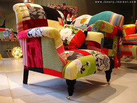
In my former post I was talking about living in a completely white interior. Furniture by Lisa Whatmough is the complete opposite. Mostly styles from the 19th century downwards but hidden beneath surfaces which simply jubilate with striking colours and patterns in combinations which could make you crazy. But it is a happy form of craziness, it makes you smile, even laugh!

Eccentric nonsense you may say but I have found out that I simply adore certain pieces of this furniture. I think the trick is to use only one single piece in one room - this helps the eye to get used to it and appreciative for the happiness those colours will spread in your house.
"What started as a desire to showcase her collection of 19th century fabrics and silk turned out to be a fascinating business enterprise for Lisa Whatmough, who set up Squint in 2005 to make bespoke armchairs and sofas". (read more on luxury-insider)


(original image sources for above luxury.insider)


 (original image sources for above squintlimited)

~

Tuesday, October 12, 2010

Living with white Interior and a little Colour Intrusion

What makes people want to live in a completely white interior I ask myself? Is it the longing for the pure per se or is it rather a trend thing or lack of inspiration or...? I really don't know but I find it a bit creepy. It somehow reminds me of hospitals, of sterilized environment, of OP rooms (as they were equipped in the past) and of people who always want to have everything under control. Am I so wrong?

I love light rooms because I live in a country where the sun is rare. Often the weather is turning the sky into something undefinably grey and your longing for sunlight becomes an obsession. So the only chance to fill your heart with a bit of lightness is to keep your rooms light. But white without some colour infusion is not the right recipe.

On a white background you can see each little spot, each little im-perfection, each little fluff. You cannot leave kids alone in a white room, not to speak of pets and when your grand-pa decides to eat chips while watching an old film you will inevitably find the crumbs on your perfect white fluffy carpet... So not a place to really live in?

So what could happen if you just add a little colour to your white interior would be this example (of course you would still have the crumbs on your carpet but...):

(sorry - lost the original image source)

The acrylic painting belongs to the Reminiscences series, a painting series, that was created from my photo documentary about the Olympic Student Village in Munich, that has been torn down 2 years ago in order to be re-constructed.

"Blue Door"
(from the Reminiscences series)
26" x 18", acrylic
©Petra Voegtle


In order to create a kind of memorial for the beautiful and often funnily painted walls which are now all lost I took hundreds of photos from the village. But this was not enough for me - I also decided to create a painting series from the most impressive and beautiful parts i.e. walls, doors and windows. The peeling paints and especially the marks all the vines left on the plaster created wonderful patterns and structures. There is an extra photo series only about these wall motifs which you will find here.

More about the painting itself and the whole series you can find under this link .

~

Saturday, October 9, 2010

Surprise in the Hallway

From the interior design point of view this hallway really does not offer too much for the eye to see - the place is simply too narrow to fill it with "stuff". But white walls and white wooden floors offer some alternatives of course - there are alway possibilities for an eyecatcher.

So what would you say if - let's assume this small and narrow corridor is on the second floor of a house and while you are climbing up the stairs - your view goes directly to this wall with that drawing of a sardonic face? Would you feel surprise? A bit? I suppose so and that would be the intention. HA!

 original image source and with courtesy of 

This drawing belongs to a series about the 7 Deadly Sins (although I have only finished 3 of them so far but it is planned to become a series of 7 drawings).

The pencil drawings of the "Deadly Sins" (on 30 gr Chinese Wenzhou paper) are quite large and therefore handled like scrolls. They are backed with a thin pongé silk, mounted on silk/paper scrolls (painted or dyed silk backed with painted Chinese Wenzhou paper) and finally hung on hand made wooden dowels, coated with acrylic lacquer (several layers) which are removable for easier storage etc.

If you would like to see the other drawings check this link.

 "Envy"
43" x 27"/58" x 32", drawing mounted on silk
©Petra Voegtle
~

Wednesday, October 6, 2010

LUXURY FANTASIES: the Bed you sleep in

~~~
"Luxury are items which provide extra pleasure 
by flattering all senses at once" 
(Wikipedia) 
 ~~~

Many people do not pay attention much to the fact that they spend a third of their lives in bed. Beds are often neglected when it comes to design or renewal. And the bedroom especially is often the stepchild of decorating and/or interior design because it is generally not accessible to the "public" as a dining room or a living room.

Now imagine you have a budget without the common limits - what would you be craving for? For a canopy bed such as this one by Irish designer Joseph Walsh ?

original image source luxury-insider

This marvellous bed is "built from wood which is sliced into thin layers, Walsh used free form bending to give the wood its elegant curves. It is a one of a kind piece." (read more luxury-insider.com)

Or would it rather be this type of bed?  
"Liechtenstein based Lomme  presents a new sleeping experience designed to focus on inducing quality sleep, the Lomme Bed.
This egg-shaped bed combines simple, minimalist design with sophisticated, cutting-edge technology to create a protected, relaxing space ideal for rest and rejuvenation." (read more luxury-insider.com)


original image source luxury-insider


Or would you prefer to sleep in a rather traditional bed but designed with exquisite types of wood, created by Parnian, a family business that specializes on luxury furniture. 
"Parnian has gained a world-wide reputation is in its exquisite hand-painted finishes. At first glance, furniture done in the custom mixed and painted finishes seem to resemble delicate porcelain, or marble. In reality, the Parnian Porcelain Signature Collection of furniture is created out of wood and wood products which are then finished in a thirty-five step lacquer/urethane resin finishing system." (from their website)

 original image source luxury-insider

And here is another option for your precious sleep from a company Vi-Spring located in Great Britain which apparently produces beds for unspeakable 84.000 $!!! But they are eco-friendly! I am sure you are paying this from your pocket money just as David Beckham....

original image source trend-hunter

I think if you belong to those people who just don't make such a fuss about headboard, foot part, inbuilt night tables etc. the following may be the right dream for you. A bed that is "hanging" free, to be placed wherever you want, a "suspended bridge bed" by Max Longin.  
 "This design was inspired after Max Longin, mathematician and designer, had been sitting on a suspension bridge and noticed the nice, calming movement the bridge produced-a perfect sensation to fall asleep to. Float is held in place by four stainless steel cords that are connected to a frame of wooden rods and steel bows which can support a weight of up to 2645 lbs." (from yanko-design)"

original image source yanko-design


or would you rather go with the Fluttua Bed for the optical illusionist???  
"Fluttua is an innovative bed design with no legs visible so it appears to be floating. It’s actually very simple, with support from the wall and one leg under the center of the bed. It gives a great visual effect, specially with the underbed lighting - look - no monsters!" (see more here)
 The bed has been designed by Daniele Lago, 2004

 original image source trend-hunter

You like stained glass - then be sure to check out this for an unusual bed:
"Xander Blue fuses the mythical glow of old-world stained glass and the sleek style of high-tech construction; creating unique glass furniture for residential and business use. Each piece is custom made by designer, Andrew Ramsgard." (from website)

 original image source trend-hunter

~~~

Sunday, October 3, 2010

A Painting that complements the Cushions

From time to time I find this funny - looking for a piece of art that complements other accessories. Hm - I don't have a problem with that even if I consider myself a serious painter. I feel that art should be on a wall and if someone is looking for a great decoration piece - fine with me.

I do not paint for mere decoration, my work is reflecting my interests, my emotions, sometimes anger but more often joy, fascination and admiration. And most of all my work is coming from memories and impressions I have had the luck to see somewhere on this world, be it in the neighbourhood or on the other side of this planet.

 original image source and with courtesy of 

"Red Door"
(from the Reminiscences series)
26" x 18", acrylic
©Petra Voegtle
If you would like to know more about this painting Red Door please see this link. If you would like to see more paintings of this series please see here.

~

Friday, October 1, 2010

Adult Content in the Living Room

I love this room for its simplicity. I absolutely love the floor and that it was not destroyed through paint whether it might be trendy or not. Wood can be so beautiful especially when it is old and talks of many years of usage. It can be even more beautiful when it is cared for as in this room. I also love high ceilings in old houses and I love old houses because they have character and personality. You probably have guessed so...

I also love the simplicity of the furniture that gives this room  its personal character - so if this were mine I would not have changed a single thing besides... Well, I must admit I have  certain weakness for little extras, which are not common, which can be a bit provocative so I would have chosen a different wall piece than the original one, such as this...

 original image source and with courtesy of 

The mural is a heavy, hand carved, sculptured wall piece, named Mithunas, which means "lovers" and which took me more than 6 months to finish (inspired by India's temple ornamentations in Kajuraho. This mural is however my own original design).
If you would like to see more details please check this link on my website or click on the photo below.
The mural has been treated with a varnish that is my own recipe so that it looks like old ivory. This increases the preciousness of this art piece and makes it look like an ancient carving. Finally it has been polished with beeswax that makes the wood smooth and shiny.


 "Mithunas" 
55" x 46" x 7", 70 kg
hand carved, pine
©Petra Voegtle
 ~